When talking about corporate image, we also mean the design embodied in the company logo itself. The process of creating this logo starts with an analysis and the subsequent development of the values that represent the company. It is at this stage that the choice of a logotype comes into play, representing both the naming of the company and the product and pictogram that completes the representation, which then becomes the overall image that the market perceives of the company. Just as it does for most of us, sooner or later, the time comes when both the corporate image and the logo need restyling!
This was also true in Pakelo’s case. This is understandably a very delicate operation, especially when the graphic style is radically changed.
The original Pakelo trademark dates back to 1968, when it was designed by the architect, Solero, in a style that was very much in vogue at the time. The typeface had a very square font and lettering with the “e” connected to the “l” and with a large “K” in the centre, and a contrasting shadow that replicated the lettering. The colours chosen for the words were black and white while red was used for the background which over time became the company’s hallmark colour. The words MOTOR OIL in capital letters were written under “pakelo” to complete the logo.
The logo was used on all the packaging for decades until the time came to consider restyling it. The design, in fact, very much reflected the standards of the 1970s with bold lines and sharp edges contrasting the rounded letters. This style, however, did not make the logo very easy to read and Pakelo was often confused with “pakedo”. Moreover, the words “Motor Oil” were somewhat limiting compared to the company’s actual business scope. It gave the impression that we only produced motor oil.
"So, it became necessary to change something. At that time, we weren't large enough to afford a graphics agency and, as many companies of the Veneto region, we did the best we could with our own resources. I still remember it like it was yesterday. I was on holiday in the mountains and I started jotting down sketches with no clear idea."
My first priority was to make the word Pakelo more legible so it wouldn’t run the risk of being read incorrectly, as well as to try to make it easier to reproduce in prints or embroidery.
Says Rino Polacco, Pakelo’s Marketing Director.
"I started with a font called Impact, a distinctive typeface, so that it would convey the right sense of strength and power to the logo. I then tried to use the same colours: the red background, the word pakelo in white with a black outline, but without the shadow effect, to give the logo a cleaner look. Lastly, the words Motor Oil were replaced by Lubricants to encompass the broader sense of our business and not just limited to motor oil. The final result satisfied me very much. The legibility was significantly improved even though the logo was different.
My father, Giuseppe, and uncle Elio were not very keen on the change, both because of a question of tradition, but also because of the risk that customers would no longer identify the company with the new logo. In the end, the final sketch ended up in a drawer for several years!
It was only later that the need for a new Pakelo logo arose. To meet the needs of the new single-brand championship Maserati Trofeo in the role of technical sponsors, the company needed a logo changed in a Racing key."


What better opportunity than this! So, in December 2002, when the new racing car was introduced for the Maserati Trofeo single-brand championship at the Bologna MotorShow, the Pakelo logo with its new graphics also made its official debut. The positive feedback that we subsequently received from visitors made us realise that we were on the right track. Shortly after, the transition to the new restyling was automatic and the logo was gradually replaced on all the company’s packaging and the official documents. The rest is more recent history for all to see.
We’d like to finish with a question that’s been puzzling us:
where did the name “Pakelo” come from?
Legend has it that Giuseppe Polacco’s daughter, Chiara, when was little couldn’t pronounce the surname “Polacco”, mispronounced it as “Pàchelo”. It was then adopted as a new term that later became Pakelo. The “K” was used to give it a more international pronunciation. Truth or fiction? It remains a bit of a mystery, but we like to think, however, that the family is behind everything, even the company’s “secrets”.

From left to right: the owners Aldo, Rino and Alberto Polacco.
(2005 - Maserati SpA headquarters, Modena)
-
ACEA 2022 Oil Sequences | Heavy Duty
-
Pakelo’s Export Manager talks about travel, human relations and technical training on oils and lubricants
-

Fia Formula 3 Championship: the Feature race was literally dominated by Trident Motorsport
-
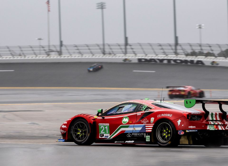
Daytona raceway: what happened at the Rolex 24h?
-
Regularity races: Does It matter more precision or speed?
-
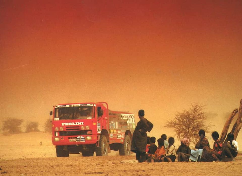
Dakar Rally 1990s | A piece of Pakelo Lubricants's Story
-
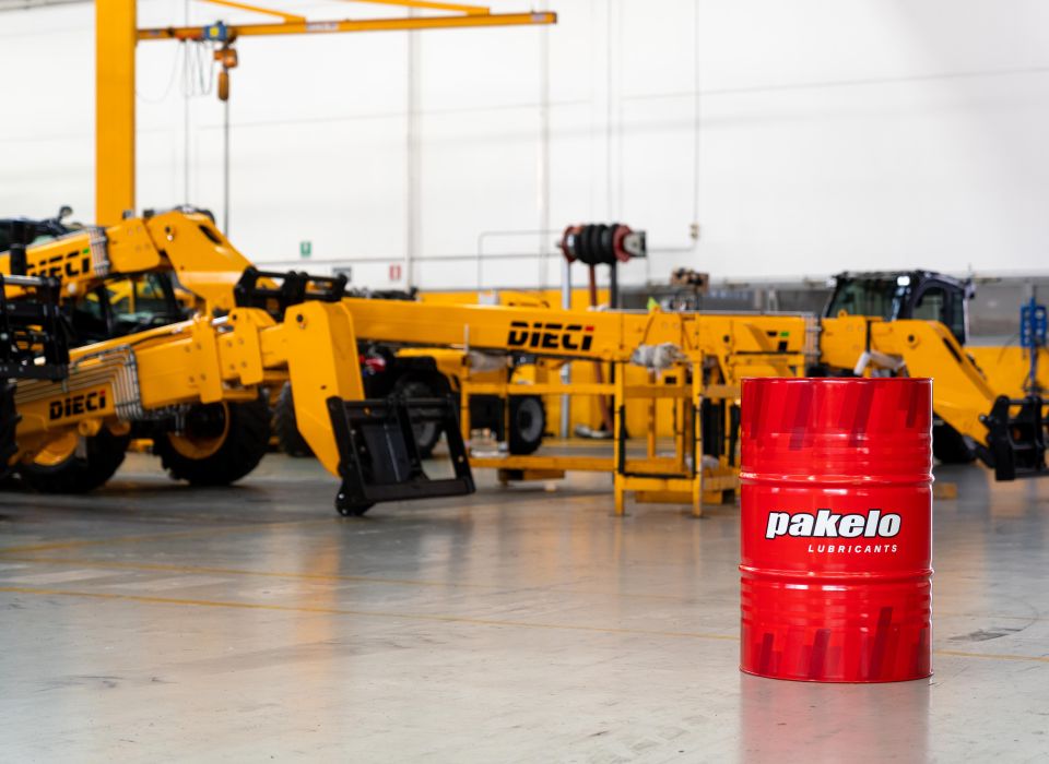
Pakelo Lubricants and Dieci Srl, a collaboration that goes on since over 10 years
-
Biodegradable, sustainable, renewable: definitions and differences
-
Low HTHS oil: how does it affect fuel economy?
-
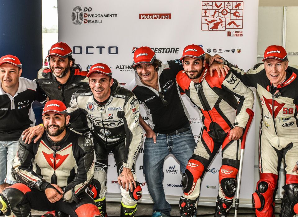
Emiliano Malagoli: Don’t call me “Hero”
-
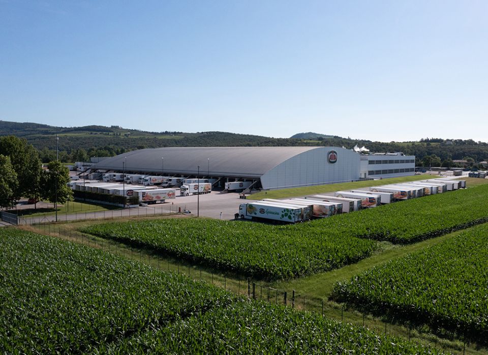
Pakelo Lubricants among the food-grade lubricant suppliers for AIA
-
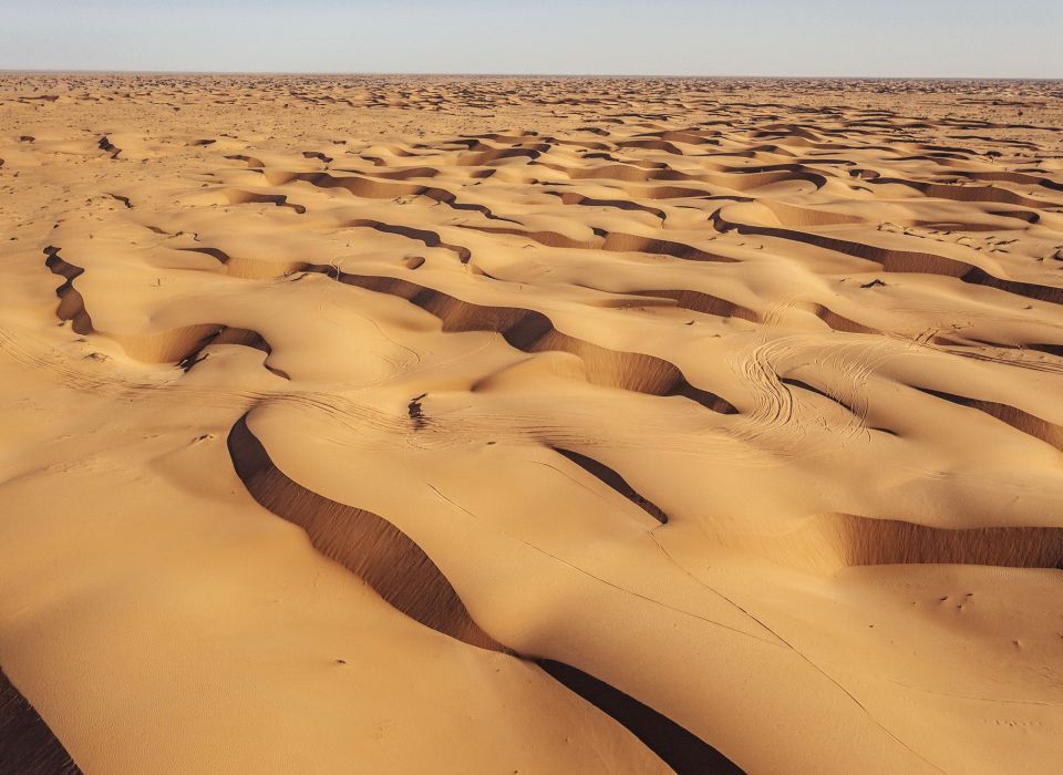
Africa Eco Race 2024 Results – Jacopo Cerutti wins
-
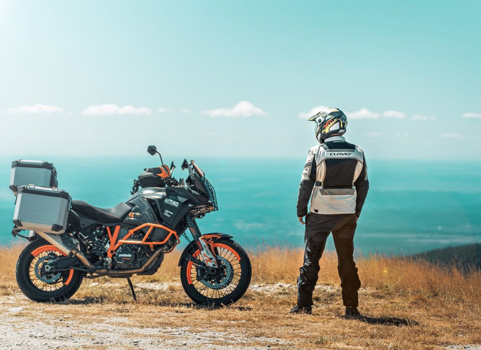
Croatia and Slovenia by motorbike: itinerary and preparation


